Design


THE THINGS WE DO
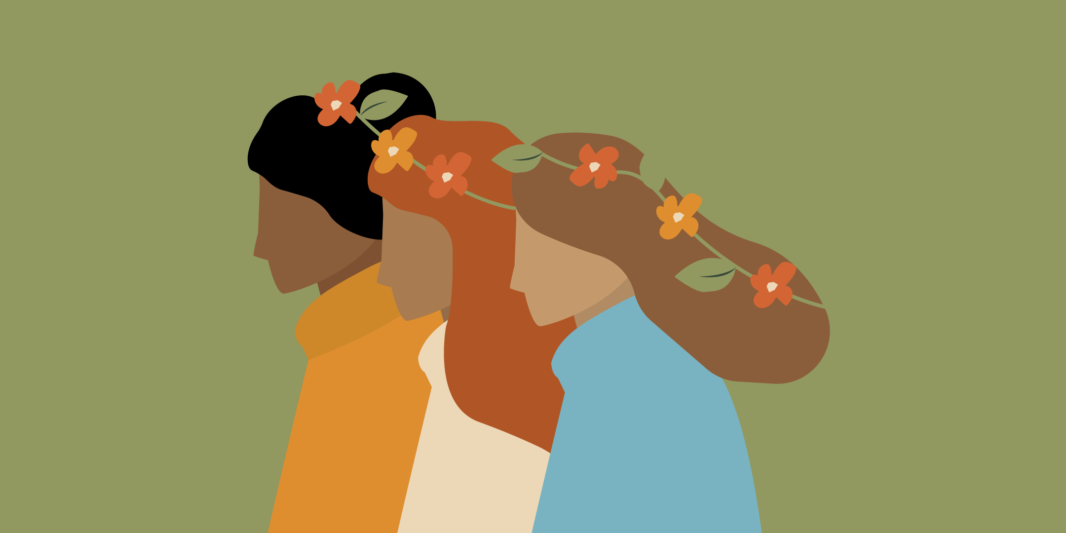
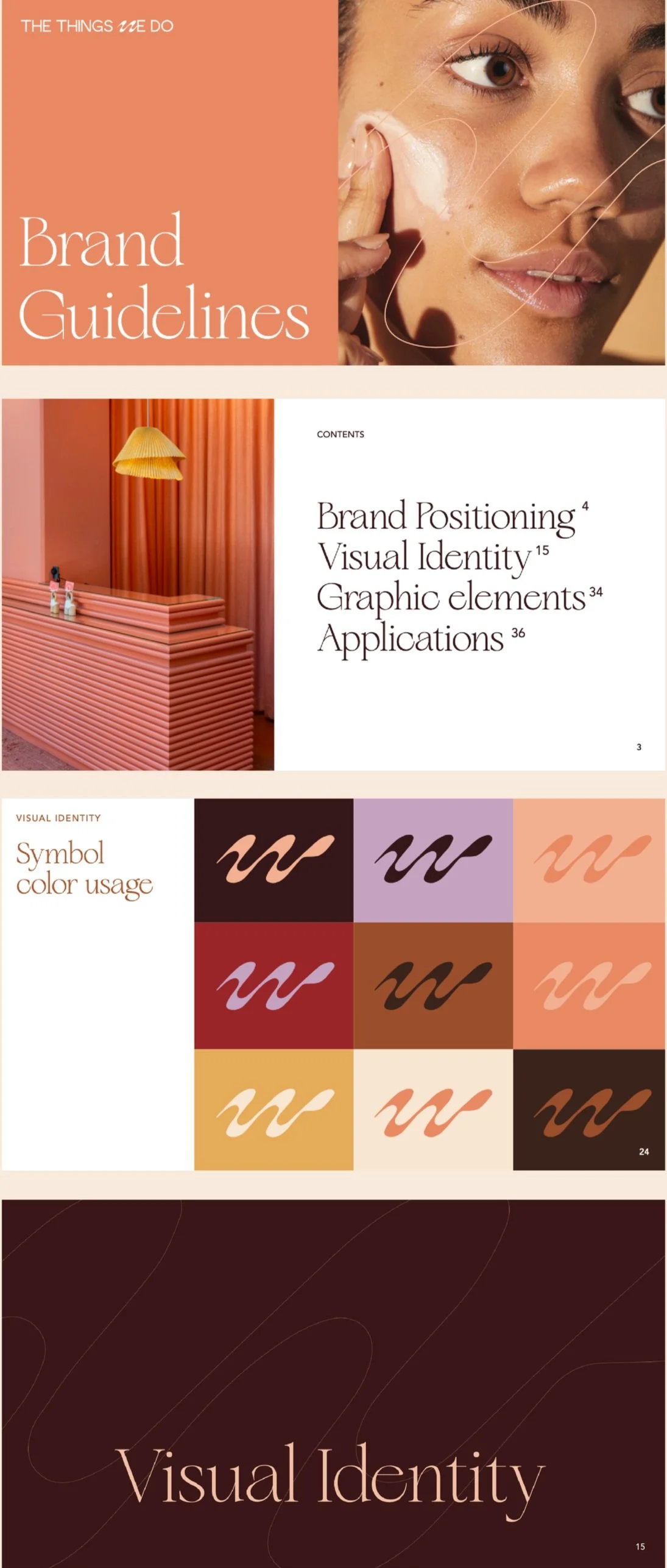
The Things We Do is a leading and trusted authority in medical aesthetics when it comes to Facial Balancing, which entails a complete facial assessment and beauty plan based on shape, symmetry, and harmony. TWD has pushed for inclusive procedures and education, by not endorsing treatments that can harm or burn skin of color. For the brand identity system, I used The W as a logomark as well as a soft, organic symbol that curves throughout the brand assets to create a sense of movement and flow of human connection and facial balancing/harmony. For the wordmark, the flow of W is paired with a sans serif font with smooth lines that conveys approachability and modernity. The colors represent the heritage side of the founder’s ethnicity, while creating a confident color statement, pulling inspiration from red wine, chocolate, tangerine, grapefruit flesh mango, lychee flesh, jade.
YEAR
2024
agency
N/A
project type
Branding, Art Direction
role
Lead Brand Designer, Art Director


For the brand identity system, I used The W as a logomark as well as a soft, organic symbol that curves throughout the brand assets to create a sense of movement and flow of human connection and facial balancing/harmony.


RELATED WORK